Welcome to our comprehensive guide on how to configure the Resource Library to create an aesthetically appealing and effective experience for your partners. In this step-by-step article, we'll walk you through the process of configuring the different elements of the library and presenting best practices and tips to maximize visuals.
For instructions on how to best structure library content, please also check out this article, and for a general tutorial on how to access and update Library settings, check out this article.

Optimize Design & Content for Visual Impact
There are two important areas that affect the aesthetics of your partner content library:
- Design: In addition to structural settings that influence the UI, the main design options within the Channeltivity Library consist of the Header Banner and Quick Search Tiles.
- Content: The best way to create visually compelling content is by customizing the thumbnails of each document.
To create a visually engaging library experience for your partners, both areas need to be considered.
Design Best Practices: Partner Library Settings
Step 1: Library Settings
To access the Library Settings, click the ellipsis icon in the top right of the header > Configure Library. 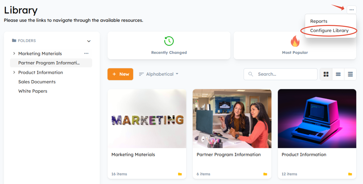
From the sidebar, you'll see that Channeltivity has a number of Library configurations that affect the UI:
- Library Settings - configure and customize Library functionality and default settings
- Header Banner - change the design and text in the Library Header Banner
- Quick Search Tiles - add tiles that link to important content or searches
- Custom Fields - organize your content and make it easier to find by adding Custom Fields to Documents
- Tags - manage Tags used to categorize content and allow easy filtering

Select "Library Settings" to configure the below items:
Mode:
The two Library modes give partners a slightly different experience:
- Folders Mode gives you a more traditional navigation where partners traverse Folders to view their contents. Folders appear in a tree and within the content panel itself as long as the sort order is set to "Alphabetical". You should pick Folder Mode if you have a lot of content.
- Flat Mode is a more modern approach that is good for smaller libraries and content that’s tagged and/or uses lots of custom fields. All content is visible on the Library home page and Users navigate and find content by searching and applying filters.
Filters:
You should enable filters to help Users filter content using Tags, Custom Fields, and Document Type. We recommend configuring the filters to appear "Below the Folder Tree."
Default Sort Order:
If you're using Folders, they will appear in alphabetical order if you select the "Alphabetical" sort order as the default. However, if you're not using Folders, we recommend using the "Recently Changed" sort order for the best experience.
Default Layout:
Use "Large Tiles" or "Wide Tiles" to ensure your content has nice thumbnail imagery.

Step 2: Header Banner
To maximize visual impact, we strongly recommend setting a Header Banner background image and customizing the text to ensure legibility by selecting "Header Banner" from the Library Configuration menu. Background images with a consistent brightness (mostly dark or mostly light) work best.
The most important thing is to make sure there's enough contrast between the text and background image. You can do this by:
- Changing the Text Color. If you have a dark background, pick a light text color and vice versa.
- Enabling Text Shadow. Set the Text Shadow Color to create high contrast with the text color. For a light text color pick black as the text shadow color; for a dark text color pick white as the shadow color.
- Enabling the Overlay. Set the Overlay Color to create high contrast with the text color. For a light text color pick black as the overlay color; for a dark text color pick white as the overlay color. Adjust the Overlay Transparency to ensure good contrast.
Create a good balance of background image visibility and making the text legible. 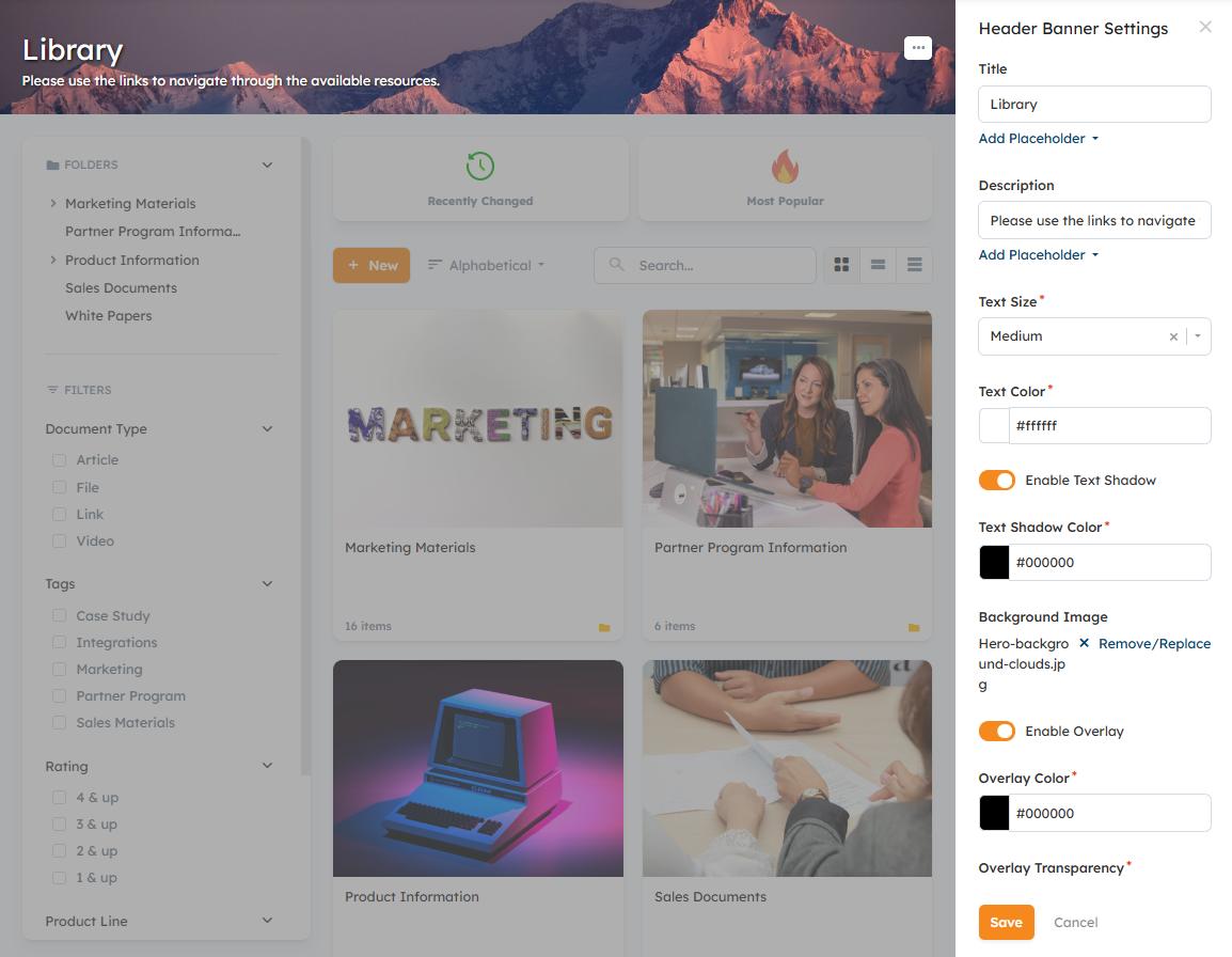
Step 3: Quick Search Tiles
Quick Search Tiles allow you to give your channel partners predefined views of Library content. Their visual nature also has design benefits, breaking up Library content and drawing the user's attention.
You can enable and configure Quick Search Tiles by selecting "Quick Search Tiles" from the Library Settings menu > Enable Quick Search Tiles.
Best practices for Quick Search Tiles to create a nice Library design:
- Use similar image styles to create consistency
- 2-4 Tiles are ideal.

Content Best Practices: Thumbnails
While the Library configuration definitely has an impact on its visual appeal, selecting and configuring thumbnails for individual pieces of content is key for an engaging partner experience.
Thumbnail Options
Thumbnails are set when you're creating Documents in the Library. Depending on the types of content added, you have a number of option for selecting a thumbnail:
- Default - a generic image that includes the title of the file on the thumbnail image.
- Generated - for certain content types, the Library will automatically generate a preview thumbnail of the file
- Custom - upload your own thumbnail image file to represent the content in the Library
For a PDF, the thumbnail selection might look like this:

Related Articles
Was this article helpful?
That’s Great!
Thank you for your feedback
Sorry! We couldn't be helpful
Thank you for your feedback
Feedback sent
We appreciate your effort and will try to fix the article